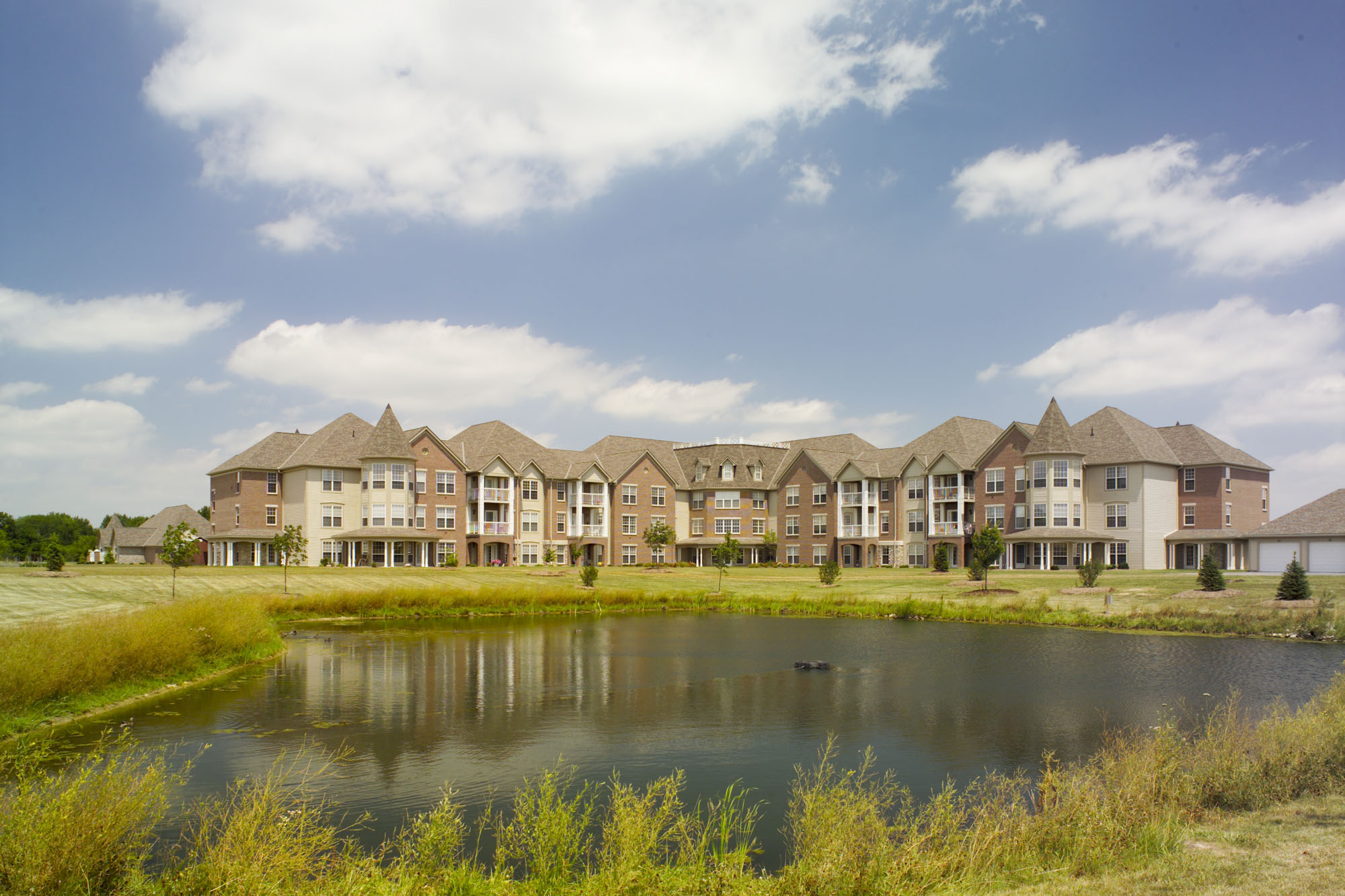
Birchaven at Eastern Woods
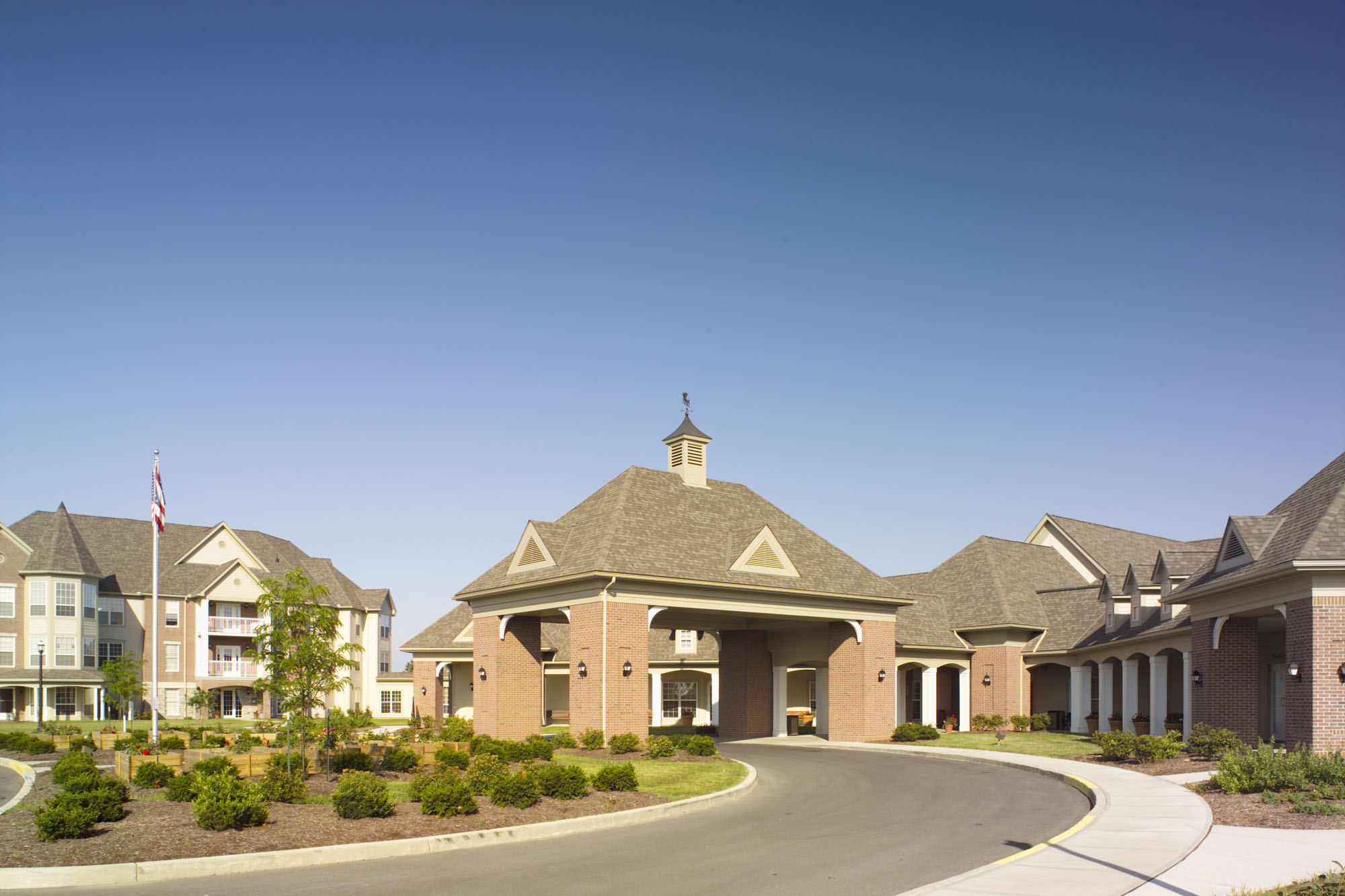
This one of a kind, state of the art retirement home is phase I of a total community development consisting of a nursing home, assisted living congregate apartment hospice, home health villas, medical, and health facilities. An inter-generational day care center located on campus is operated in conjunction with 2 local universities. The “Main Street” environment allows residents to have an opportunity to intermingle with children and toddlers alike.
Prior to the start of schematic design, the management team of Blanchard Valley Health Association (BVHA), the owner, and members of our staff visited several recently completed nursing homes. These visits were to assist in programming, evaluate what was “good” in the eyes of BVHA and to ascertain what improvements needed to be made in the Birchaven replacement facility as compared to other new facilities. As a result of these tours, two of the stated design objectives for the new facility were to create a building that gave a sense of “Community” for the residents and to address and mitigate the”way finding” problems that are common in larger single story nursing homes that utilize clustering as a part of the design concept.
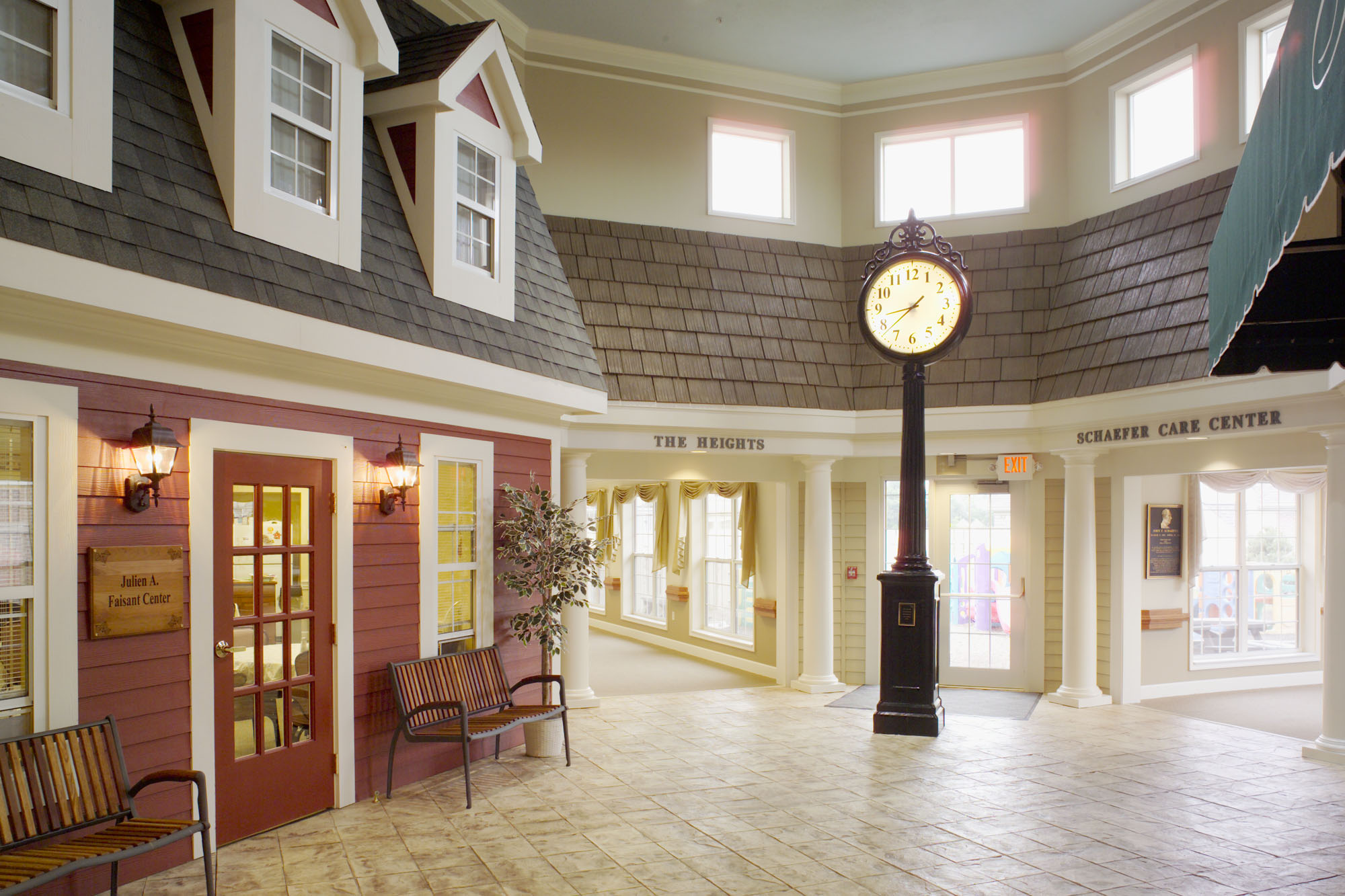
A “Main Street” concept with a significant presence was envisioned to enhance the feeling of community. This needed to be more than a mural or a few awnings hung on a corridor wall as others had previously constructed. To be effective, “Main Street” had to be a substantial facility with amenities that are found in most “communities”. People of all ages had to be drawn to the facility for it to be a lively and fun place. A grant was obtained to enhance and enlarge the existing child day care operation into an inter- generational studies facility operated in conjunction with the University of Findlay. This program brings children, students and elderly living outside the community into the facility. Several of the Owner’s service businesses such as hospice and home health care were re-located within the “Main Street” facility to enhance the operation, and create an active environment.
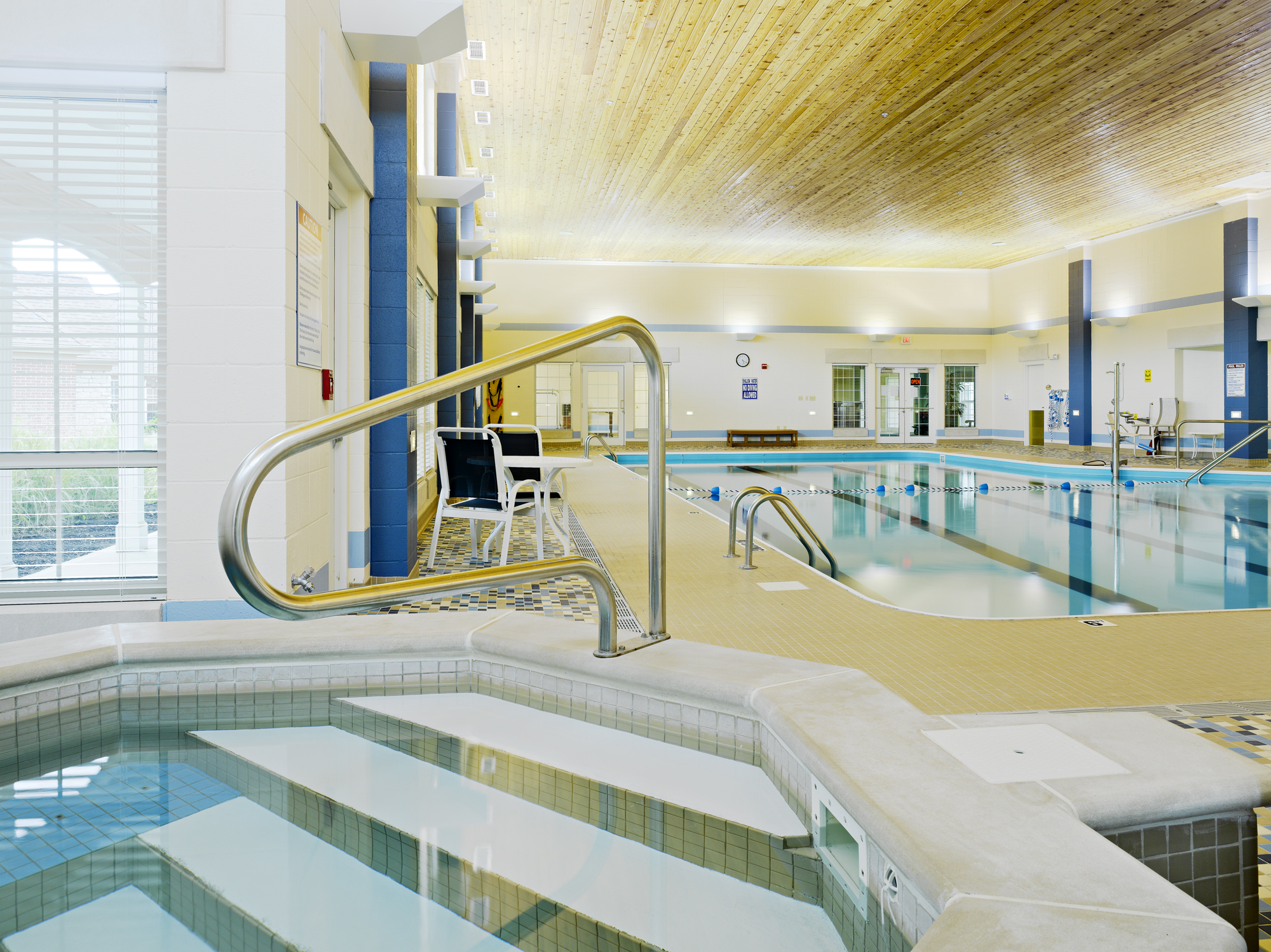
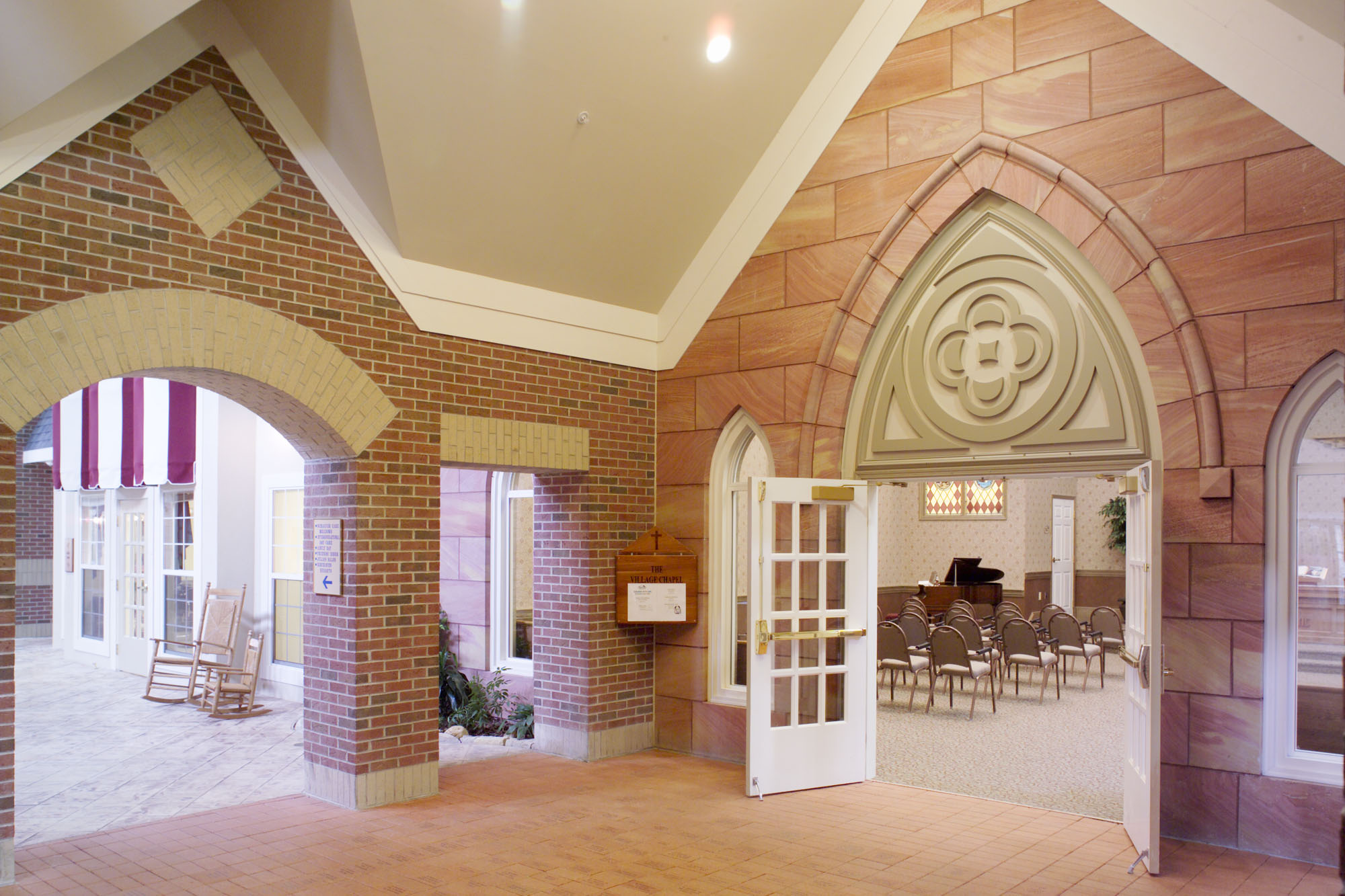
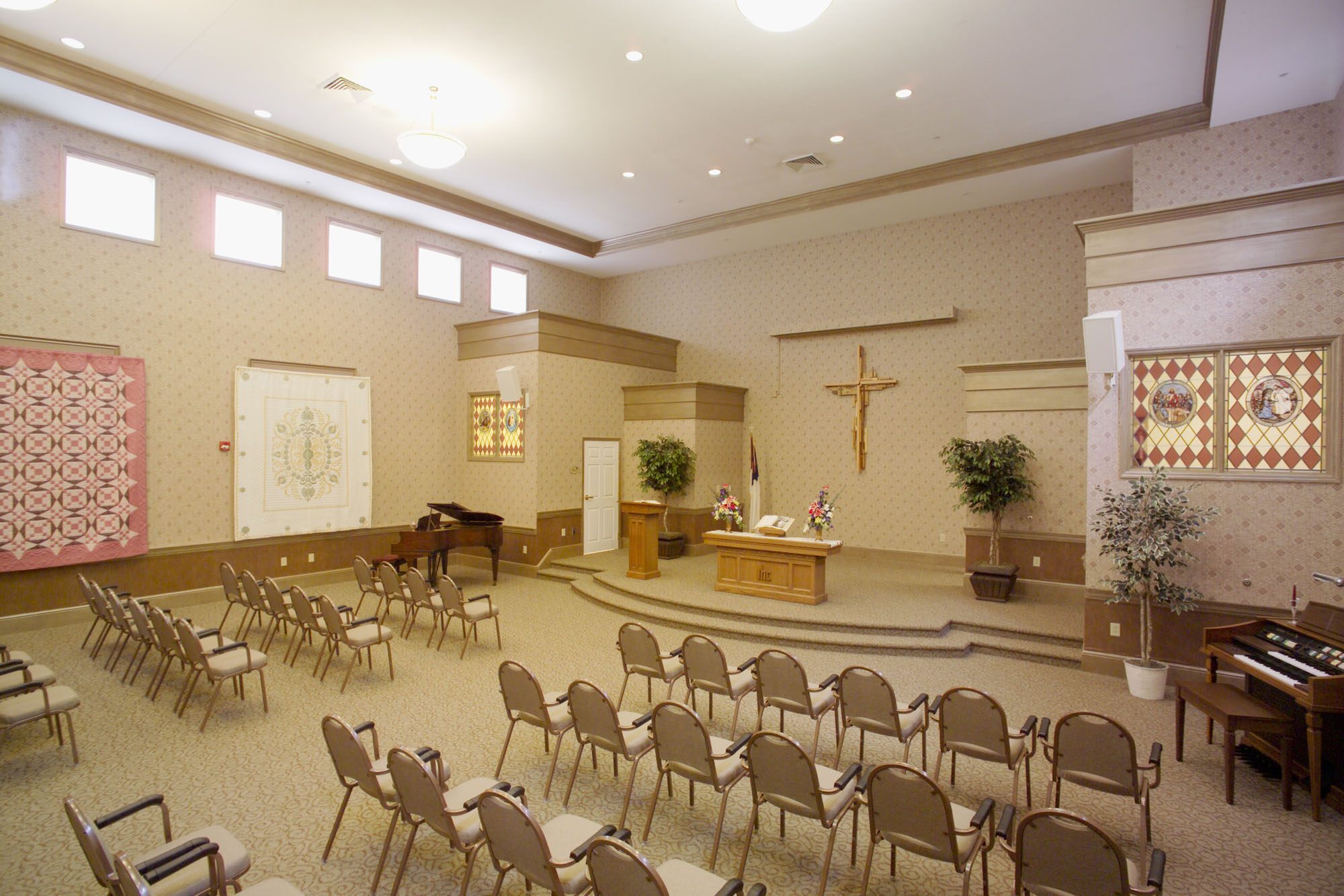
A large volume clerestory lighted space was designed with exterior building fronts as the “Main Street” entry to each of the program functions. The building fronts were designed to appear similar to what one would expect of a building type found in the community-at-large. As an example, the Chapel is designed with cut sand stone and Gothic arches utilized in many early 20th century churches. The Daycare Center is designed as a one room school house and the bank as a stout brick building with cut stone trim. Traditional architectural styles were used, along with high quality building materials, to appeal to the semi-rural desires of the intended population. Landscape planting areas were cut out of the embossed concrete pavement / floor to provide for building foundation plantings. A brick arcade was designed at the intersection of the “T” in “Main Street” to break-up the length of the space and create a way finding clue to disoriented residents. An exterior playground is designed at one end of the “Main Street” for use by the day care children or on rainy days they can just go downtown to “Main Street”. At the other end of Main Street is an exercise / wellness center which is part of a future expansion that will include a pool. Due to the success of the facility, this addition is planned to begin construction in 2005.
The public address (PA) system for the building was designed for use in ways atypical of other facilities. The PA provides cues to various activities versus institutionally broadcast announcements which, except for emergencies, are avoided. For example, a distant train whistle is played to signal the noon train which indicates that lunch is about to be served.. The system is zoned to allow different uses in various spaces and to have volume controls or on/off switches as needed.
An additional way finding element was designed at the entry to each pair of nursing home neighborhood / clusters in the form of an entry mini-Main Street. Each entry is designed as a distinctive house front denoting which way is “home”. Additionally, a separate facade marks the way to the Main Street core areas. The third wall of the mini-Main Street is primarily glass for day lighting purposes.
We, along with the BVHA staff and management, are very pleased and proud of our design for the new Birchaven Retirement Community. The facility opened at 100% occupancy and remains at capacity. It continues to be big news in the area and has been featured on a Public Broadcasting Services television program. However, like every project we complete, the end result is reviewed with a critical eye for improvement. The following incite was gained from Birchaven:
1) The arcade feature at the intersection of the “T” is not necessary for way finding with the variety of building types used. We have made note that this feature does not allow for the expression of building corners one would see on an outside street scape.
2) Clerestory lighting alone, while providing very good interior day lighting, does not approximate outside lighting in brightness. More curtain wall windows would be a plus if budgets permit the design inefficiencies this would require.
We have two similar facilities featuring “Main Street” scheduled to open in early 2005 and 2006 and have implemented what we have learned from this project into both designs. We look forward to showing you these projects when completed.
To view the main portion of the Birchaven Village project on our portfolio click here.
Awards and articles are listed on our Partial Project List
